Thursday, September 25, 2025

Blog 5

 Deep Focus


Still image from Jurassic World (2015) 


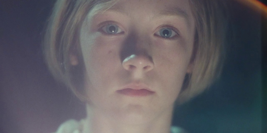
Soft Focus


Still image from Atonement (2007)


Shallow Focus


Still image from 50/50 (2011)


Deep Focus


Deep focus example, I used multiple elements to create narrative and a interesting shoot.


Soft Focus

Soft Focus example, I modified the lens with Vaseline to create a dreamy effect. 


Shallow Focus


Shallow Focus example, I used simply a blurry background made with the camera tool.


Reflection: 

I really enjoyed doing this assignment, it was definitely a challenge but preparing the whole set made it more enjoyable. One of the biggest challenges, for example, was soft focus. It's a bit ironic because I thought it would be the easiest of the three – I thought it was just a little Vaseline through the lens – but I was wrong; Soft Focus was a technical challenge, as the lens was covered (with Vaseline) it was very difficult to make the elements of the composition visible or to focus on them. Not only focus the elements was difficult, but also the light, for example, the photographs were very bright, my solution was to clean the lens and place a minimum amount of Vaseline and also adjust the light in the settings of the phone.

On the other hand, shallow focus was not easy either, the biggest challenge I faced was to focus the main subject of my composition without losing the narrative of the background. For example, in my first shots the background was very blurry because I don't know how to use the camera tools, then I realized -although it is embarrassing to admit- that I could fix that problem simply by touching the element I wanted to highlight/focus on. After solving that, everything went smoothly.

Last but not least, Deep focus. It's funny because I was very stressed trying to understand this one and it ended up being the easiest to do -I hope my example is good- and one of the ones I enjoyed the most. After reading the article and watching the videos I was a little confused, according to what I understood "Deep focus" would be the entire narrative panorama within the same frame/shoot, that the audience has the opportunity to explore the entire frame. In order to capture all the narrative I wanted to express, I first made sure that all the elements are in focus on the frame, then I tried to tell a story with the elements I had (a dinosaur devouring a fish near the audience and another fish far behind because it is scared because it knows it will be next one to be devouring). I'm a little disappointed because even though it was easy to do I still feel like I could have done it better.

Overall, I liked most of the results and I really enjoyed doing the set, I feel that with each post I learn more even if it is stressful.

Thursday, September 18, 2025

Blog 4

 Height

Still image from Eternal Sunshine of the Spotless Mind (2004)


Level

Still image from Harry Potter and the Deathly Hallows- Part 2 (2011)


Angle

Still image from The Dark Knight (2008)


Distance

Still image from The Dark Knight (2008)


Height

Height example, I used Bird's eye perspective.


Level

Level example, I used Dutch tilt.


Angle

Angle example, I took the picture from below with a low angle.


Distance

Example of distance, I used more than one room with the intention of creating layers.


Reflection:

Experimenting with angle, height, distance and level was something totally new for me, I didn't expect it to be so challenging to make more intentional compositions and above all I didn't expect it to take me so long to understand the meanings of each of these elements. One of the hardest things, for example, was to get these cinematic concepts and their meaning into a single photo, and yet after trying and trying my best I still feel like it's missing something. One of the biggest challenges was definitely distance, not only was it difficult to comprehend, but also difficult to capture and, above all, to align all the elements so that it didn't look like just a photo taken from afar. For distance I obviously thought of a photo from afar, but I didn't want to do it in an empty place, to make it seem more distant I opted to use my kitchen and garage, so the doors looked like "layers", a complex place with several layers. I tried to make a more meaningful composition using the 'noise' that creates all the clutter and elements around the 'subject' to create an emotional isolation effect.

Distance was not the only challenge to create my photographs; the second most difficult element was height.  For this element, after researching, I decided to use the most obvious option – Bird's eye – because I thought it was the easiest to do (but I was clearly wrong). Bird's eye is easy in terms of comprehension but it's definitely not easy to execute. I had many challenges for this element, such as my subject did not listen to my instructions, the high place where I was to take the photo was stiff and it was also very difficult to align the subject with the rule of three and keep the camera stabilized with my shaky arm. After all the inconveniences, I am proud of the result of that photograph.

Last but not least we have level and angle. For level I tried to do a Dutch tilt; The only hard thing about this is that the photo seemed to be taken accidentally and not prepared/intentional. Angle was my favorite -because it was the easiest to make-. With angle I didn't have to try as hard because the low angle naturally makes the subject look more powerful. Overall, this post was a challenge for me but also enjoyable.


Thursday, September 11, 2025

Blog 3

"Mise en scène"


Contrast:

Still image from Poor Things (2023)


Front:

Still image from Amélie (2001)


Size:

Still image from MirrorMask (2005)


Color:
Still Image from The Fall (2006)


Contrast:
Example of contrast, I used a dark background and a lamp to create contrast between shadows and light.


Front:
Front example, I used a simple background and centered the subject in the middle of the frame.


Size:

Example of size, use a simple background and two figures of different sizes next to each other to create contrast.


Color:


Color example, use a simple background and place a bright red object so the frame focuses on it.


Reflection:

Creating these photographs made me realize how difficult it can be to balance many elements from mise en scène in a single frame. Composing and balancing these elements intentionally is not easy at all, for example, one of the most difficult challenges I faced was identifying the difference between color and contrast -and I still don't fully understand it- when I was taking the pictures for color and contrast I din't really know what to do at first,  the conceps were a quite difficult for me to understand. I was thinking that for contrast it was a good idea to have an object of a bright color with a simple background but I thought that would fall into the color category so I opted to do the contrast I already knew, lights and shadows. The original idea I had for contrast I implemented for color, but I had a problem with the configuration of the phone that made the photos very bright and I got the impression that the background (with a circle of light) attracted more attention than the object, so I chose to create a set with not very flashy colors -yellow and blue- and include a more striking colored object -a red rose-,  In this way the object stood out more and the image stood out for its colors. Another challenge was in Size because all the large objects I had were out of the frame and were very similar in size to my small objects, as I was attempting to create a contrast between both objects I looked for a medium size and a very small one and I got closer to both objects (cinematography) to give the impression of a more noticeable difference in size. Last but not least, Front. For this one I used a stuffed animal as a subject in the hot spot, ignoring the rule of thirds and putting it in a position facing directly towards the camera. and breaking the fourth wall. 


Thursday, September 4, 2025

Blog 2


Rule of thirds. 

1.


Still image from The Queen's Gambit. (2020)

  In The Queen's Gambit (2020), the rule of three is not only used to balance the elements of the screen and make it pleasing to the eye, but also to demonstrate the difference in power between the two characters who are going to face each other in the chess match. Beth is seated, while her opponent is standing offering her hand in greeting, this act may seem friendly between opponents, but in reality Beth is being underestimated because of her gender in the sport. The photo suggests tension between the characters who are about to face each other without the need for context or dialogue, it also suggests the idea of a conflict between characters and opposition between them. Beth's gaze is directed at the "hot spot" which suggests that she is determined to win, while her opponent's gaze is directed at her in a condescending manner, which suggests that her opponent is confident and ensures victory as her own. The rule of three draws the audience's attention to the hand of Beth's opponent who suggests challenge/challenge and who in turn is in the "hot spot". The position of the characters also uses the rule of three not only to capture the viewer's attention but also to demonstrate the physical dominance of Beth's opponent and Beth's mental and strategic dominance, a crucial detail in developing tension between the characters.


2.

a)


Landscape without applying the rule of thirds. 


b)


Landscape applying the rule of thirds, subject on hotspot, horizon aligned.


3.

a)


Single figure without applying the rule of thirds, the figure is centered in the frame.


b)


Single figure applying the rule of thirds, the subject is on the hotspot.


4.

a)


Two figures without the rule of thirds.


b)


Two figures, neutral spacing with the rule of thirds.


c)


Two figures suggesting attraction via thirds.


  For my individual example of the rule of three, I put both subjects on the vertical grid lines, for added visual engagement. Also, I aligned the eyes of the objects to the upper hot spot. In the neutral composition, both figures were only sharing a frame, however, in this composition both figures are looking at each other, suggesting attraction. As the composition is balanced, it means that the characters do not suggest differences (either dominance, disinterest) but equality or agreement between them. The characters are positioned in the frame in a way that shows interest in each other, and they are at angles where the focus of attention is directed to the "hot spot". Without the need for context or dialogue, the rule of three shows that these characters have an interest in each other and develop a connection. Both characters are placed symmetrically with vertical lines to develop the aesthetics pleasing to the eye. This shows that the rule of three is not only used for aesthetics but also to tell a story in a single shot without the need for movement or dialogue that demonstrates the relationship of the characters.


d)


Two figures suggesting conflict, turning they backs, opposing gaze.


Blog 11

 Representation/Hall Still video from   Spider-Man : Into the Spider-Verse (2019) In the scene where Miles sings 'Sunflower' emotio...